Margrethe Odgaard

Textile and colour designer Margrethe Odgaard approach colour as a rich sensory experience. By immersing herself in the intricate interplay of colour, material, and light, she seeks a deeper understanding of how we experience and emotionally connect with our physical surroundings.

Balancing her time between commercial collaborations with renowned companies like Kvadrat, Muuto, Montana, HAY, and IKEA, and an artistic practice rooted in self-initiated research and unique work, Odgaard has showcased her work in solo exhibitions at prominent museums such as Willumsen’s Museum (DK), Röhsska Museum (SE), Designmuseo Helsinki (FI), and Munkeruphus (DK). Since 2023, she has  been associated with the Parisian gallery Maria Wettergreen, where her unique works are exhibited and made available for purchase

Her work has garnered numerous prizes and awards, including the Three-year work grant from The Danish Arts Foundation in 2015, the prestigious Torsten & Wanja Söderberg Prize in 2016 and most recent The Art, Design, and Architecture Prize from the Einar Hansen og Hustru fru Vera Hansens Fond in 2023.

Before setting up her design studio in 2013, Odgaard worked as a printing assistant at The Fabric Workshop and Museum in Philadelphia, USA, followed by seven years as textile designer in the French fashion company EPICE. She graduated from The Royal Danish Academy of Fine Arts, School of Design in 2005 with additional studies at Rhode Island School of Design in USA.

Margrethe Odgaard Studio
Strandgade 75 C
3000 Elsinore, Denmark

Studio enquiries
hello@margretheodgaard.com

Colour Palette for Montana, 2019

MO MON 19

1/10

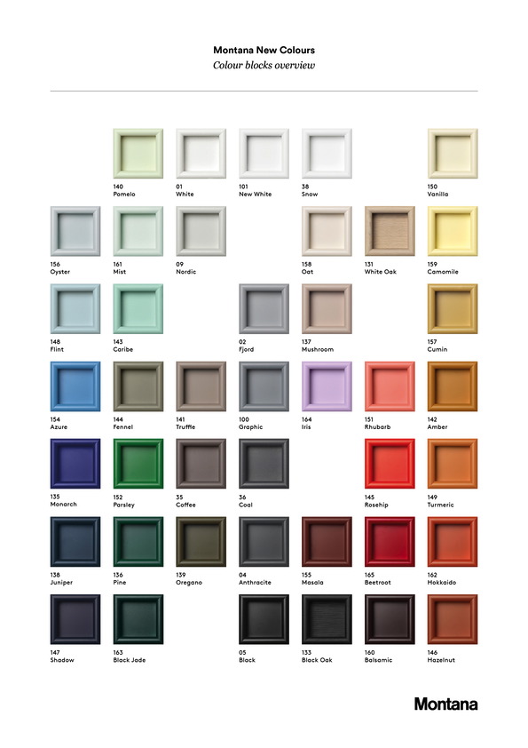
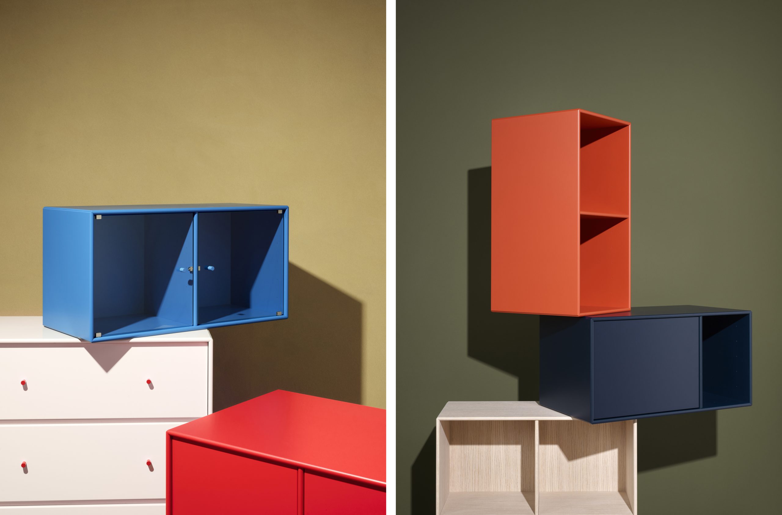
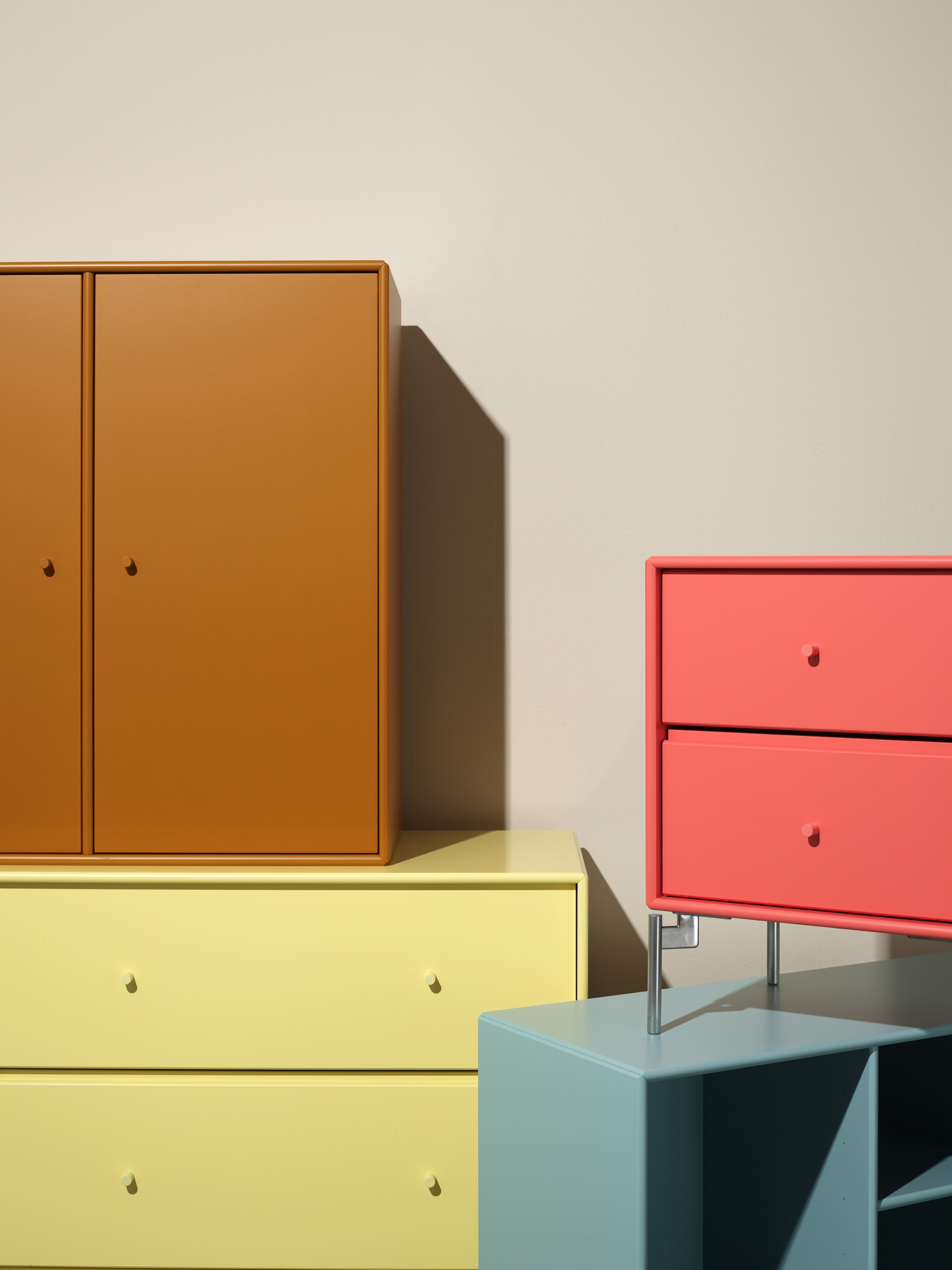
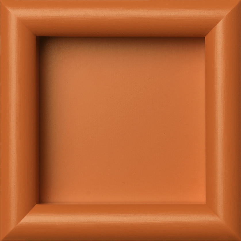
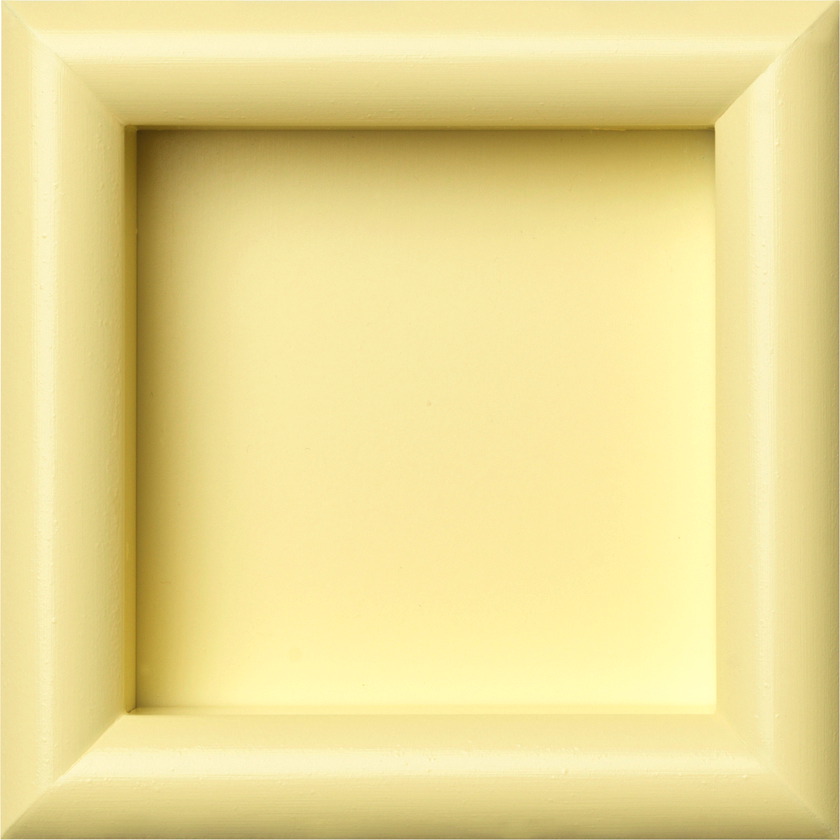
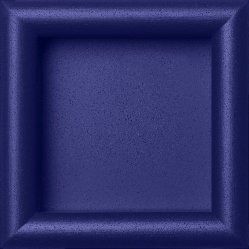
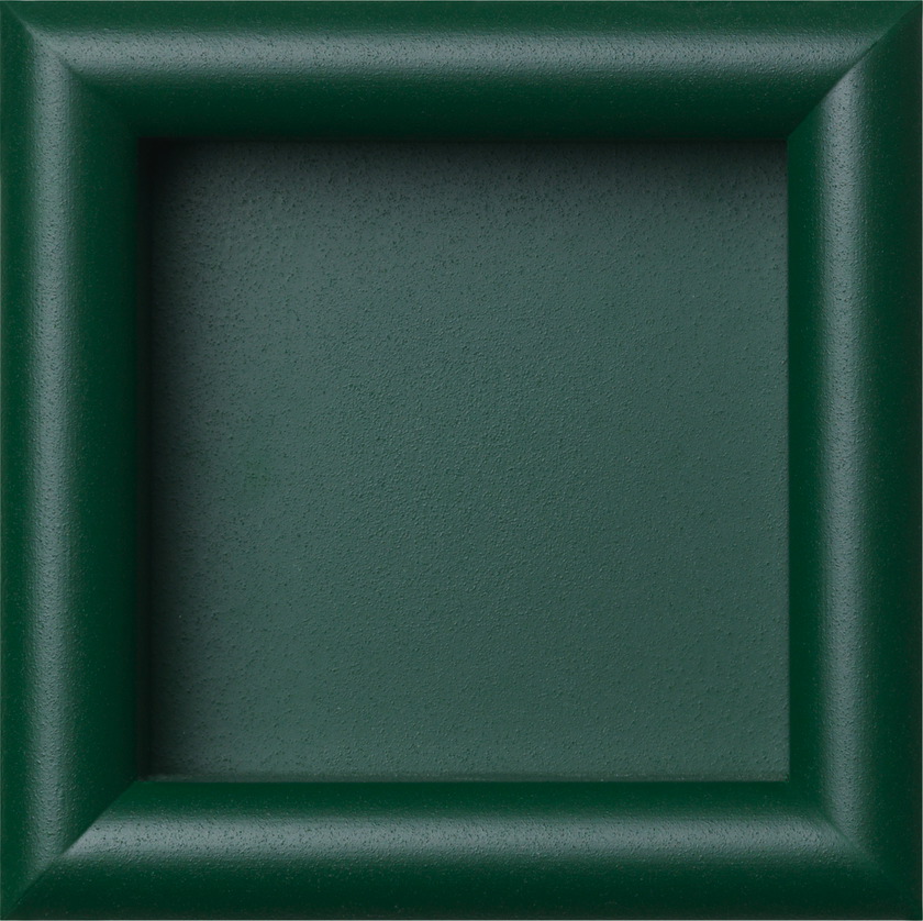
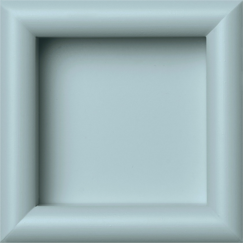
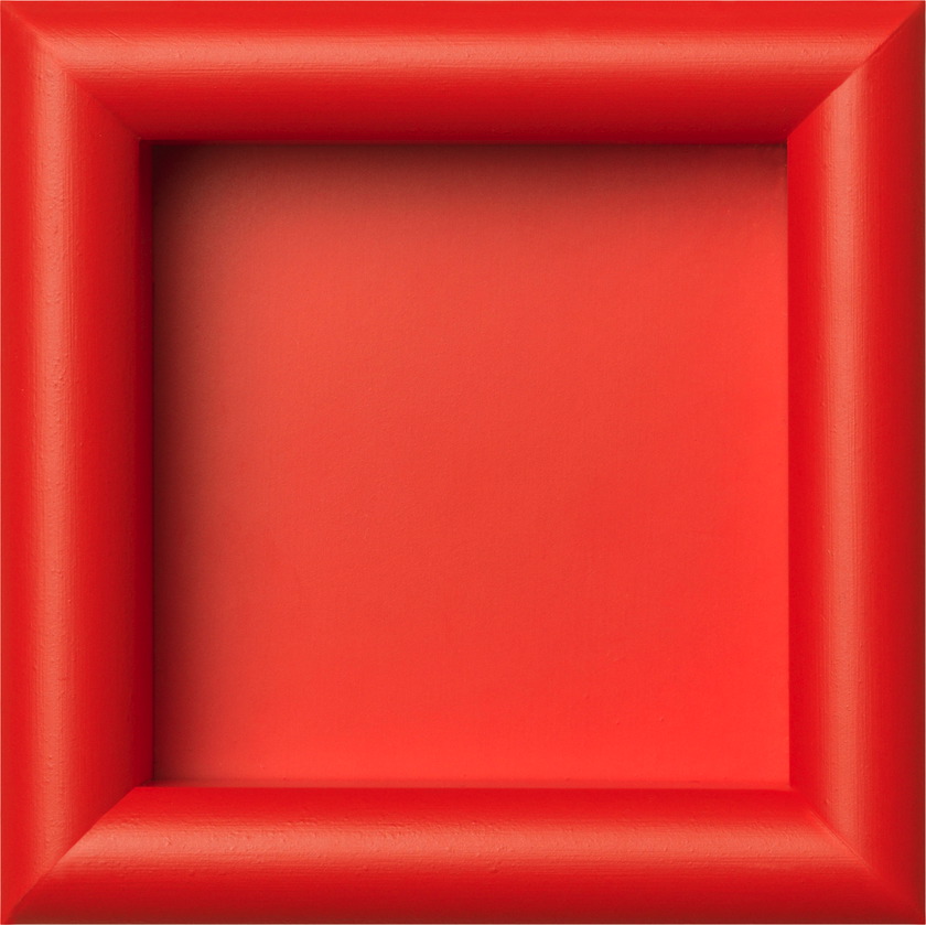
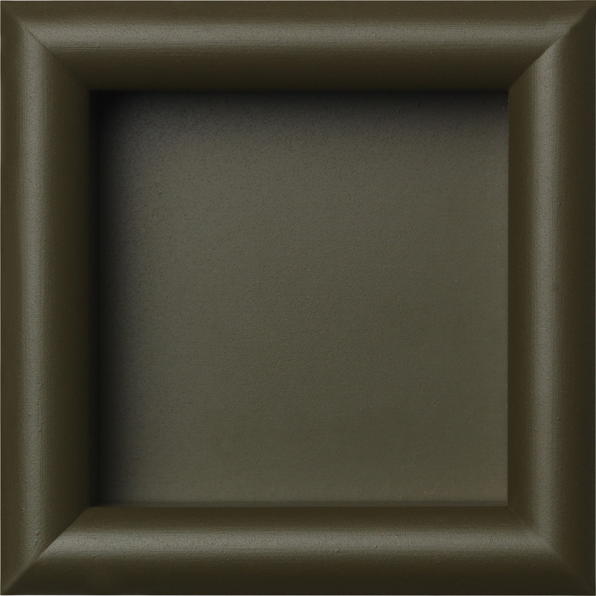
Collection of 30 new industrial varnishes for Montana Furniture. The process of developing the new colour palette for Montana has been rooted in a body-mind philosophy: the belief that our bodies long to be cared for, to be heard, and to have space. The colours should, in every way possible, refer to the body and relate to sensory perception and tactility. The names of the colours all refer to the senses and are easy to remember and pronounce: examples include Truffle, Pomelo, Chamomile, Oyster, Mushroom and Pine.

It’s important how the colours relate to other senses such as scent, taste and touch. If the colour has a balanced and nourishing expression, if it evokes memories of pleasurable tastes or scents, you are much more prone to surround yourself with it in your home,” explains Margrethe Odgaard.