Colour Diary Japan, 2015
MO CDJ 15
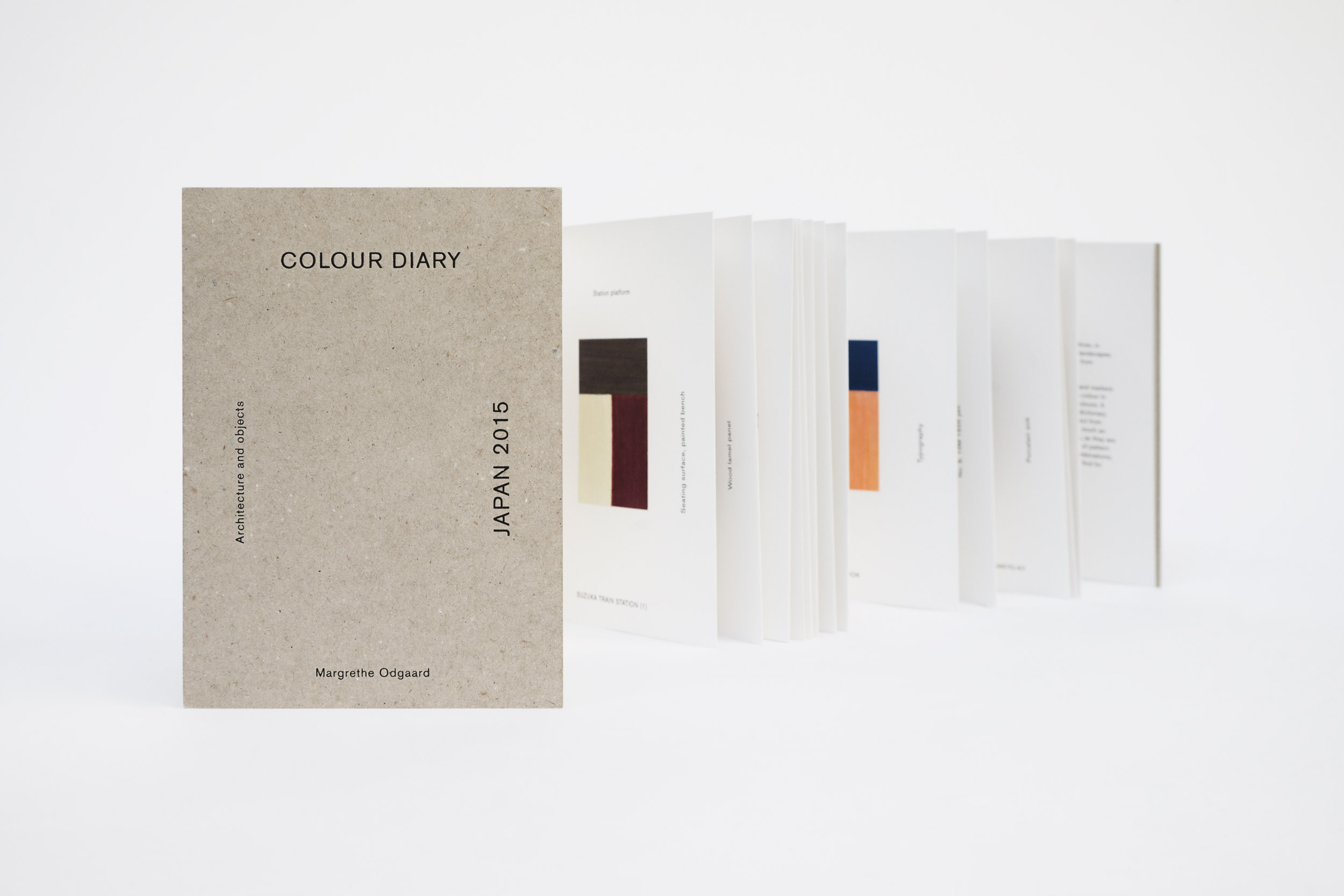
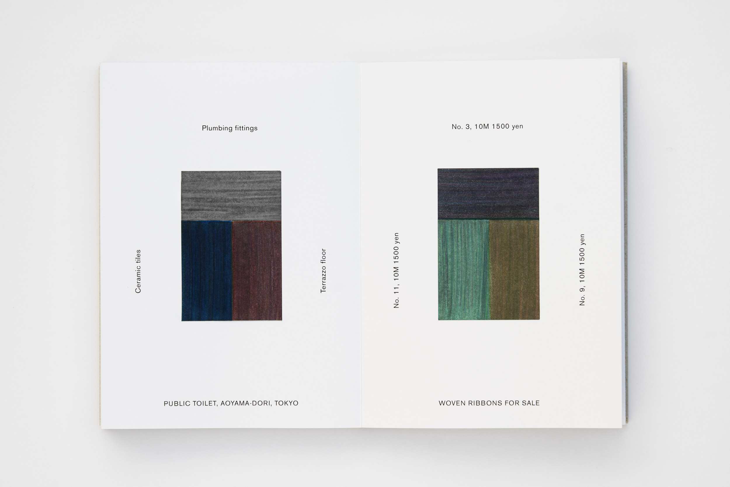
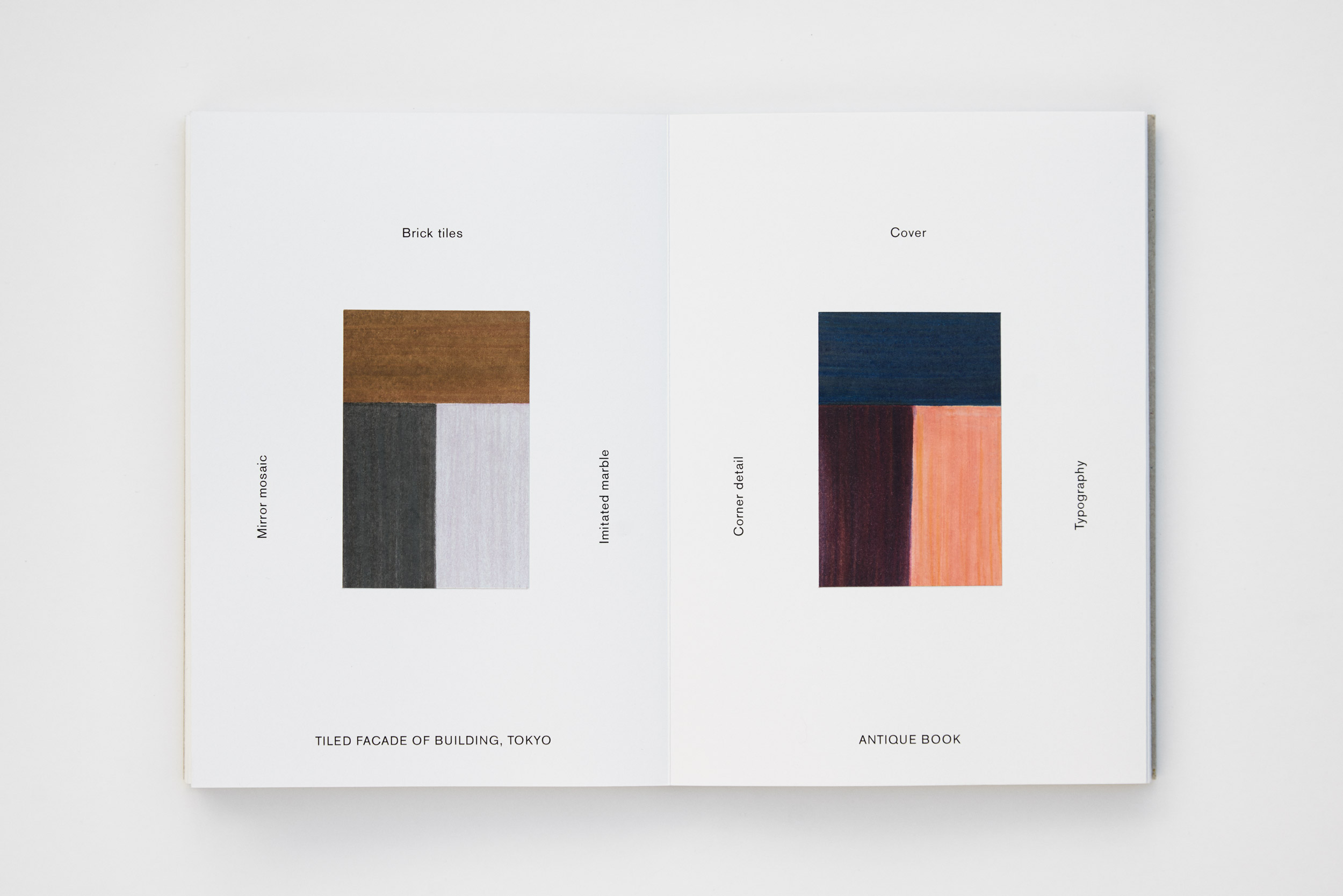
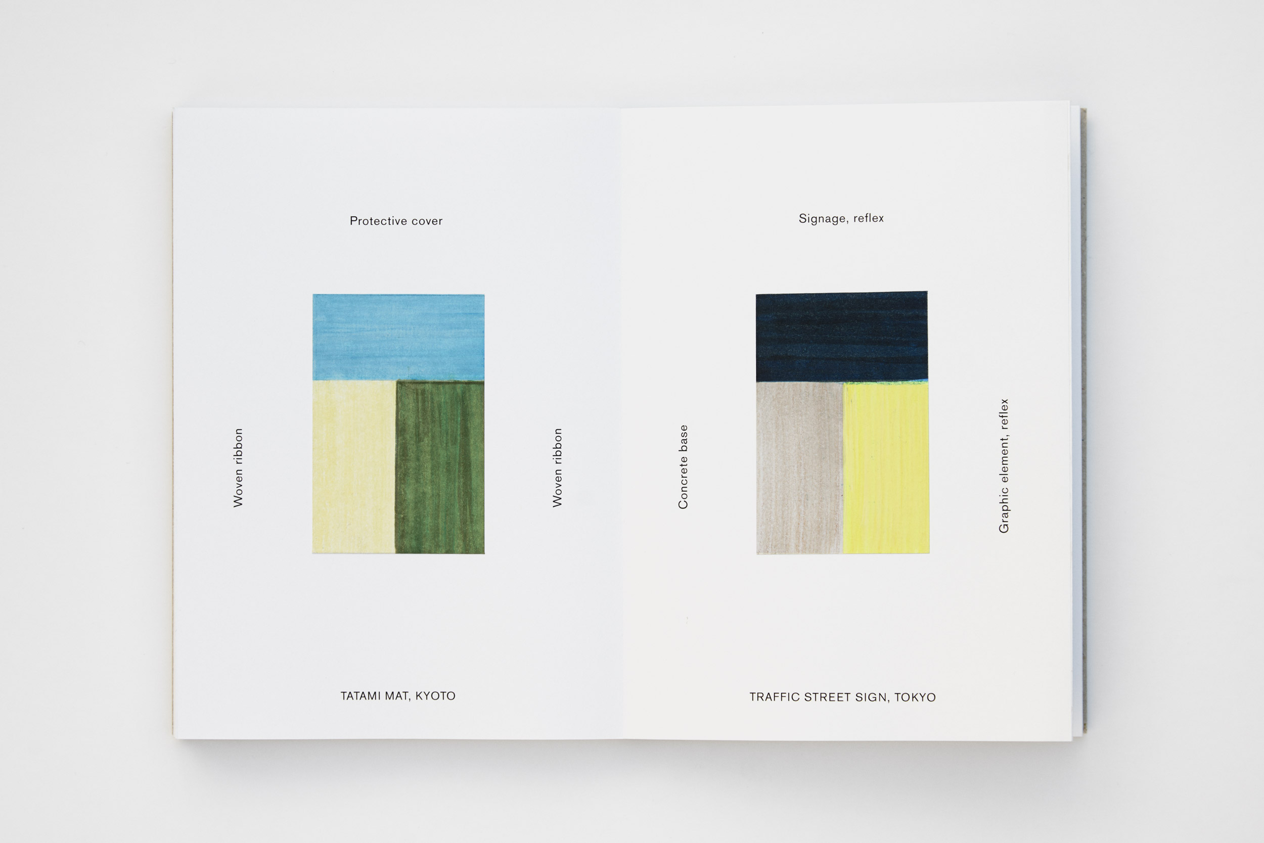
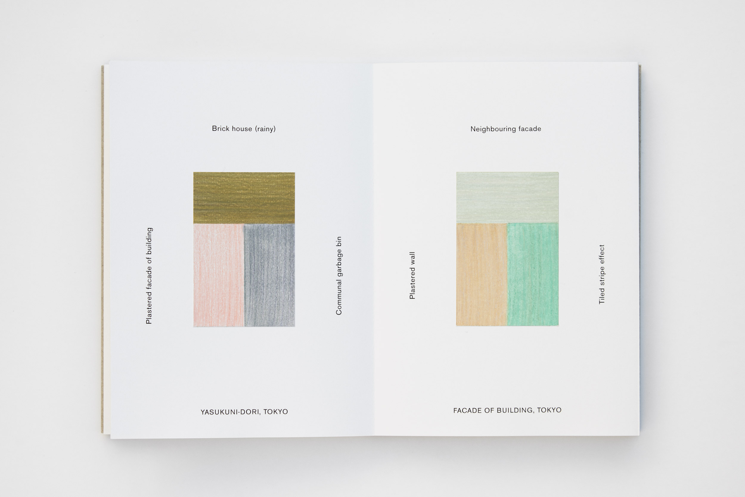
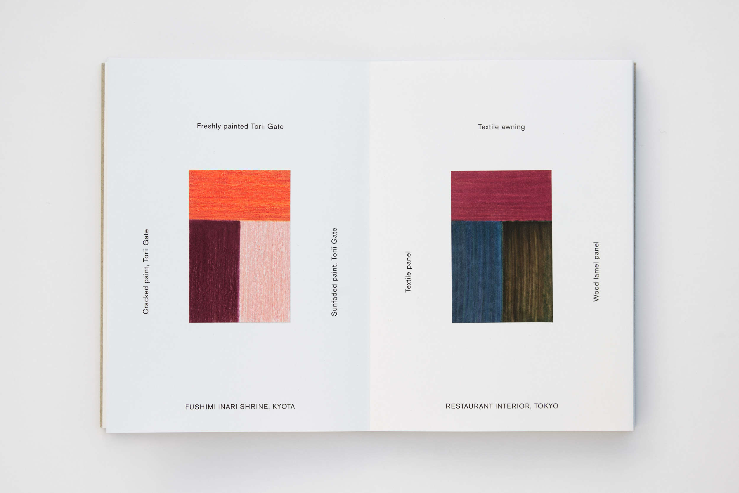
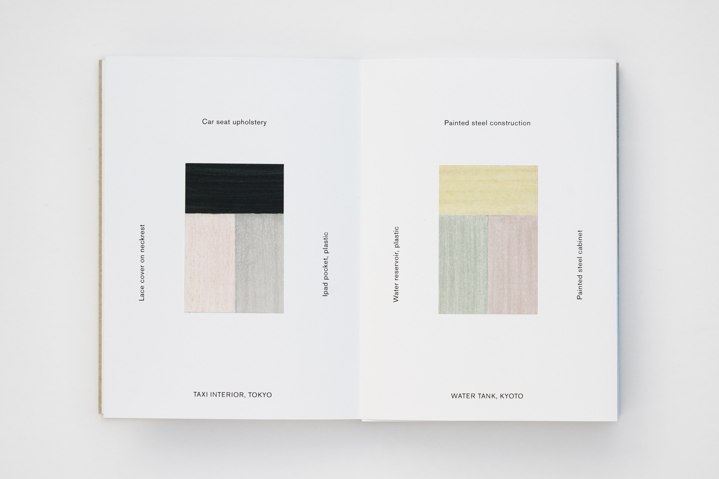
Colour diary of colour combinations found in objects and architecture in Japan. The diary was created during a two-week study tour in Japan in the autumn of 2015. Biking around in the urban landscapes of Tokyo and Kyoto, Margrethe Odgaard painted colour combinations in architecture and objects that she intuitively found appealing or intriguing.
“Iro, the Japanese word for colour, also means ‘lover’ and ‘the feeling or mood of a thing’. Japan has a rich tradition of using colours as a language of attraction, ranging from delightful soft pastels to dynamic contrasts of hue, always combined in highly refined ways. The culture seems to embrace the language of colour with a natural inclination to use them as reflections of our delicate feelings.
I was curious to find out if the combinations would bear any evidence of their underlying cultures. We often turn to nature as the true master when working with colour. Just think of the delicate shades of green red-stemmed moss in a forest or the vibrant feathers of a jungle bird. In this case, however, I was interested in colour combinations created by human beings in architecture and objects. These colour schemes could be seen as evidence of choices, behind which there had to be traces of tradition and culture. The question is, to what degree do cultural preferences influence what we consider good colour combinations? And what makes some combinations catch the eye more than others?
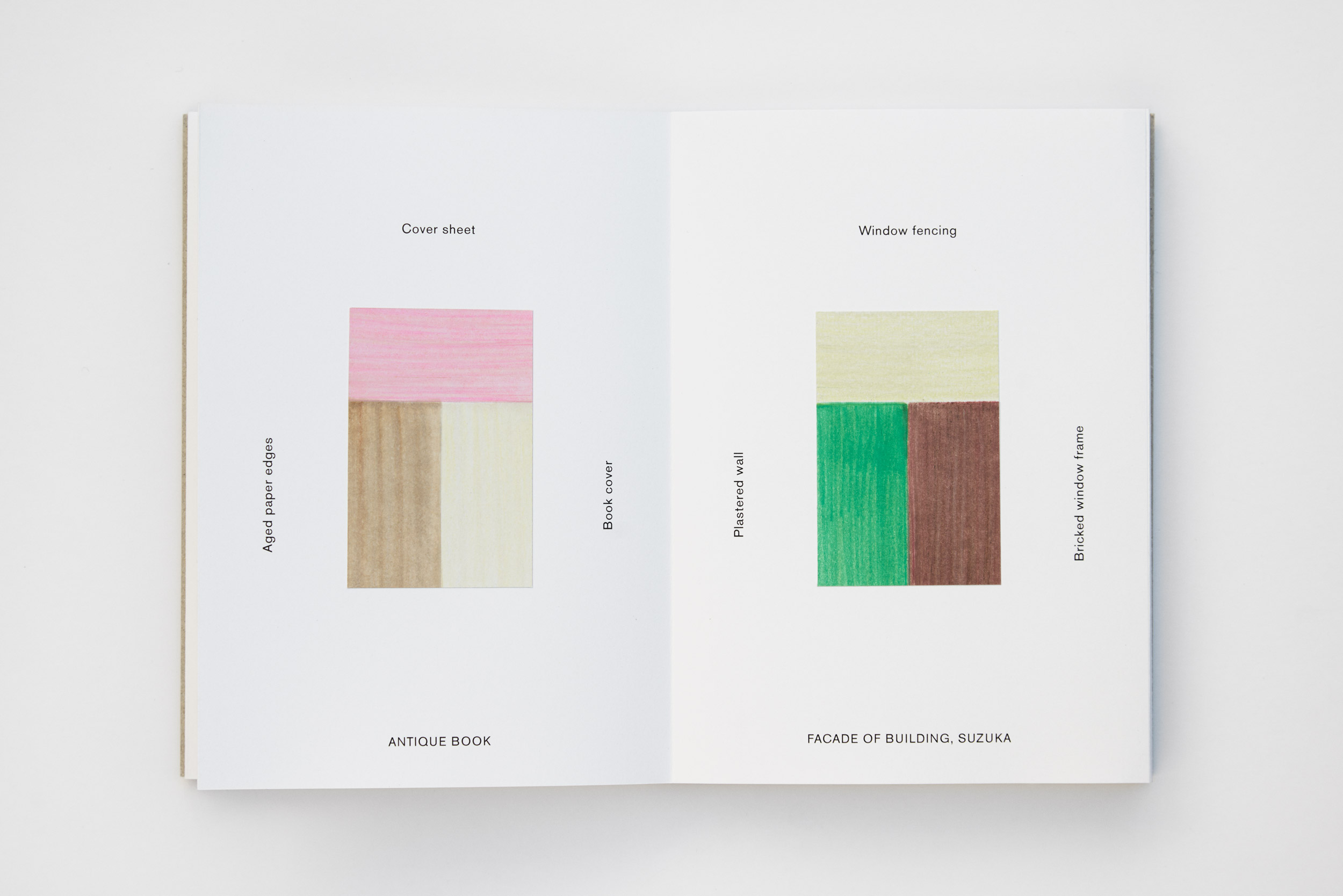
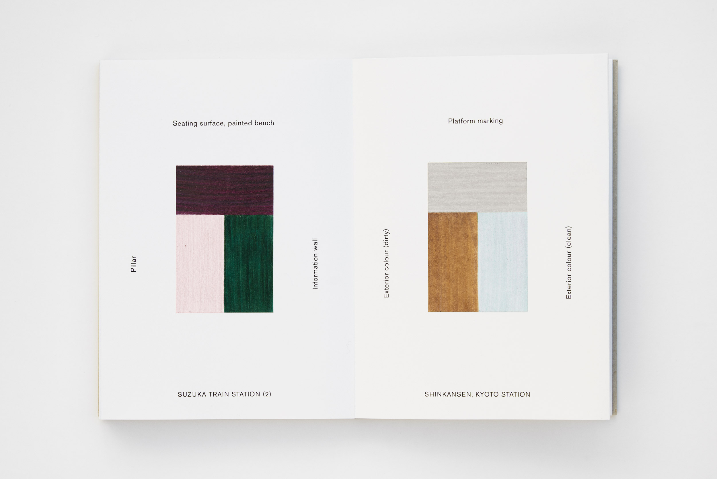
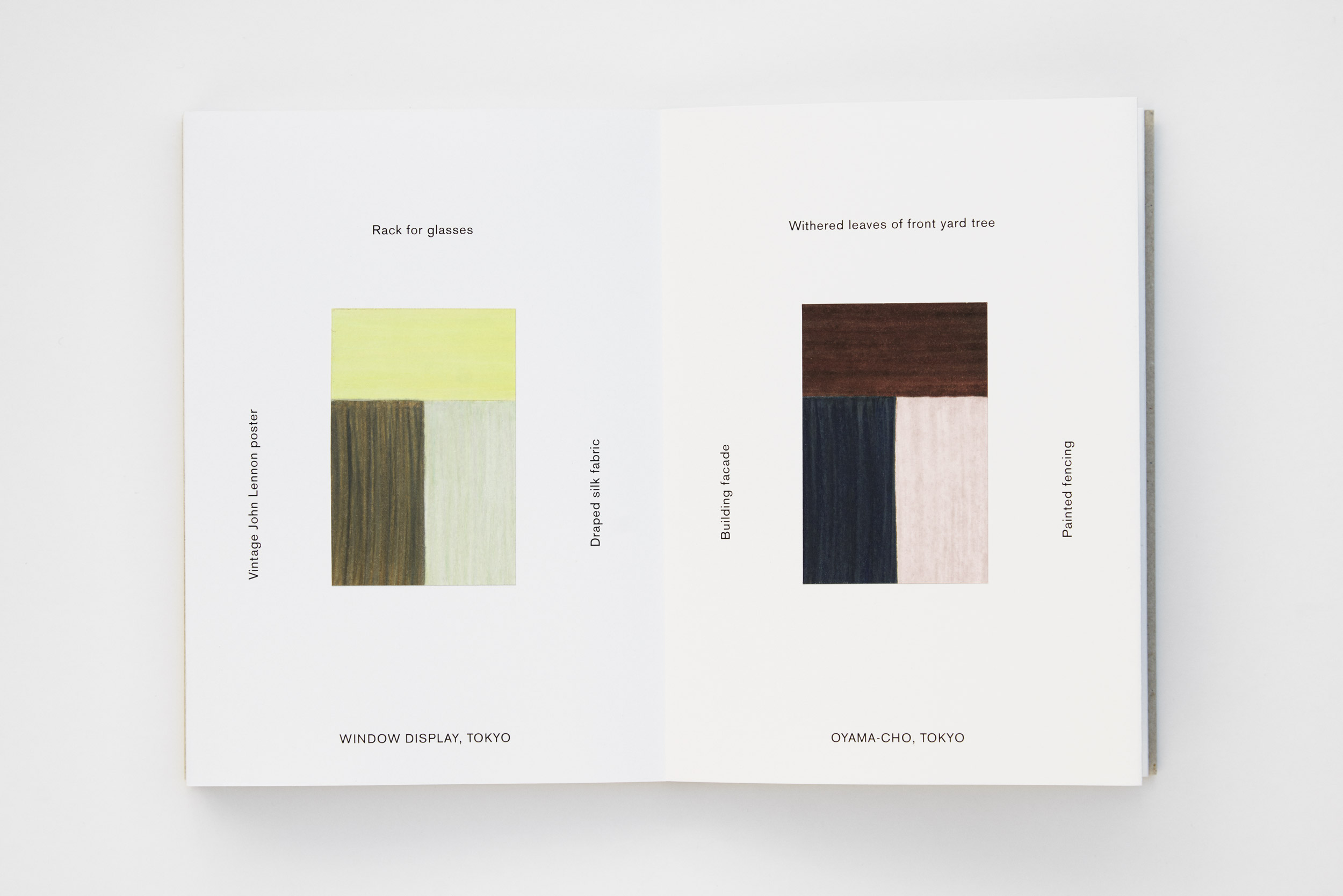
My choice of three-colour combinations was conceived as a visual reference to the musical chord. To me, the combination of colours can be compared with music scores; some melodies are just catchier than others. A note on a piano has a certain sound, but it is only when it is put together with other tones that it becomes a melody. In the same way, we can speak of hue, saturation and brightness of a singular colour, but when two or more colours are put together, they form an inner hierarchy and rhythm, influencing the perception both visually and emotionally.
The colour diaries were painted on-site to ensure accuracy in the colour shades obtained by layering a mix of crayons and markers. With the function of each colour noted next to the painted swatch, I wanted to indicate the relationship between the colours.
The diaries are as much an expression of my personal colour preferences, as they are of the given culture’s colour scheme, but it is my hope that anyone flipping through the pages will see traces of a colour identity emerging from the combinations. What began as a personal study has come to form an important aspect of my understanding of colour and helped me realize how profoundly our choice of colours is influenced by the light and nature in a given culture, and how cultural preferences have roots in the way nature shaped life”.
Louisiana Channel about Odgaard’s makings of colour diaries: